Every iconic film image carries an origin story. Sometimes that story involves months of painstaking design work and artistic vision. And sometimes—more often than you’d think—that story involves a designer shrugging, grabbing whatever was nearby, and hoping nobody would notice. The astonishing thing? These lazy shortcuts often become the very elements we remember most, the visual signatures that define entire franchises. This is the paradox of production design: sometimes the best solutions are the ones that barely qualify as solutions at all.
The Matrix’s Sushi Cookbook
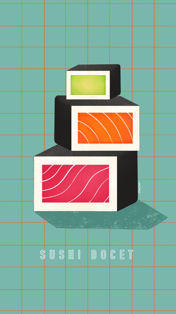
The Matrix (1999) defined cyberpunk aesthetics for a generation. Its cascading green code became instantly iconic—posters, t-shirts, Halloween costumes, screensavers. Millions of people stared at that code and felt they were glimpsing the fundamental structure of digital reality. The designer who created it must have been a visionary, right? Someone who understood computer programming and binary language and the visual poetry of data streams?
Not exactly. Production designer Simon Whiteley needed symbols that looked vaguely Asian and futuristic. He scanned characters from his Japanese wife’s sushi cookbook—specifically, recipes and ingredient lists. The cascading code that represents the fundamental building blocks of simulated reality is literally “salmon,” “tuna,” and “California roll” falling down the screen in reverse.
This revelation should diminish the code’s impact. Instead, it somehow makes it better. The Matrix’s themes of illusion and surface-level reality gain an extra layer when you realize its most iconic visual element is itself a surface-level illusion—random symbols that mean nothing but look meaningful. It’s accidentally perfect, a production shortcut that accidentally reinforces the film’s central metaphor.
Star Wars’ Junk Aesthetic
George Lucas revolutionized science fiction by making his universe look used, lived-in, and cobbled together. This wasn’t visionary world-building—it was a budget constraint. The production couldn’t afford to custom-manufacture futuristic props, so they raided junk yards and hardware stores, spray-painted random parts, and glued them to everything.
The Millennium Falcon’s interior panels? Cafeteria trays. Stormtrooper weapons? British Sterling submachine guns with minor modifications. Luke’s lightsaber hilt? An old camera flash handle. Darth Vader’s chest panel? An electrical junction box from a British department store. The Death Star’s surface detail? Model railway parts and kitchen sink pieces glued in geometric patterns.
This wasn’t clever repurposing—it was desperation. But desperation created what polished design never could: a universe that felt tangible and real precisely because it was made of real things, however mundane. The junk aesthetic became Star Wars’ signature look, so influential that subsequent films with unlimited budgets deliberately made their props look like repurposed junk, creating new items specifically to look old and cobbled-together.
The Wizard of Oz’s Toxic Snow
The Wizard of Oz (1939) needed snow for the poppy field scene. Real snow would melt under the studio lights. So the production used what was then a common movie snow substitute: asbestos fibers. Not just any asbestos, but 100% pure chrysotile asbestos, milled into fine white flakes and dumped liberally over the actors.
You can watch that scene now and see Judy Garland and her co-stars frolicking in a known carcinogen, breathing in fibers that would later cause mesothelioma and lung cancer. The production didn’t use asbestos because it looked good—they used it because it was cheap and fireproof (studio lights were genuine fire hazards at the time).
The snow looks magical on screen. It catches the light beautifully, drifts gently, coats the actors in a pristine layer that photographs better than real snow ever would. The toxic solution created the perfect image. This isn’t funny like sushi code—it’s horrifying. But it reveals the same principle: production design often prioritizes what works visually over what makes sense logically, ethically, or medically.
Indiana Jones’ Hidden Mickey Mouse
The hieroglyphics in Raiders of the Lost Ark (1981) required authentic-looking Egyptian symbols. The production hired consultants to ensure accuracy, but in the Well of Souls scene, if you pause at exactly the right moment, you can spot R2-D2 and C-3PO carved into the hieroglyphics.
This wasn’t lazy—it was actively mischievous. But it represents a broader truth: production designers often hide jokes, references, and shortcuts throughout their work because they assume (usually correctly) that nobody will notice. Most viewers will never freeze-frame hunt for Easter eggs. They’ll absorb the overall impression and move on.
The hieroglyphics looked appropriately ancient and authentic at normal viewing speed. That was all that mattered. The Easter eggs were insurance against boredom for designers spending weeks creating background details most viewers would ignore. This principle extends throughout production design: if it looks right in motion, the particulars don’t matter.
Alien’s Oysters and Organs
H.R. Giger’s biomechanical designs for Alien (1979) look like nightmares made flesh—organic, sexual, disturbing. The xenomorph’s inner mouth mechanism looks like evolved predatory anatomy. What was it actually? A lamb tongue manipulated by wires, with oysters and shellfish arranged around it.
The chestburster that explodes from John Hurt’s chest combined a mechanical puppet with actual animal organs purchased from a butcher shop—pig intestines, hearts, stomachs—all dumped onto the actor as the puppet emerged. The realistic gore wasn’t effects wizardry; it was literal animal parts from that morning’s meat delivery.
Giger’s designs used bones, vertebrae, and preserved specimens arranged in unsettling configurations. The “alien” aesthetic that influenced decades of science fiction horror was created by buying actual animal remains and posing them weirdly. The genius wasn’t in creating something entirely new—it was in recognizing that real organic materials, arranged strangely, look more alien than fabricated props ever could.
Pulp Fiction’s Briefcase
Quentin Tarantino’s Pulp Fiction (1994) features cinema’s most famous MacGuffin: the glowing briefcase. Fans have theorized endlessly about its contents. Marcellus Wallace’s soul? Gold? Diamonds? The secret is anticlimactic: it’s an orange light bulb on a battery.
The briefcase needed to glow when opened but couldn’t contain anything specific because Tarantino wanted it to remain ambiguous. The production’s solution was almost insultingly simple: put a light inside and don’t show the contents. The “golden glow” that’s launched a thousand theories is hardware store supplies assembled in five minutes.
This reveals something crucial about iconic images: the less defined they are, the more powerful they become. If we’d seen what was in the briefcase, it would have disappointed us. The light bulb solution wasn’t lazy—it was accidentally brilliant. By providing no answer, it became every answer.
The Sound of Laziness
Sometimes the shortcuts aren’t visual but auditory. The Star Wars blaster sound? A hammer hitting a radio tower’s guy-wire. The lightsaber hum? A film projector motor combined with interference from waving a microphone past a television. Chewbacca’s voice? Bears, walruses, and designer Ben Burtt’s own voice processed through various filters because actual recordings of the animals they wanted weren’t available.
Sound designer Gary Rydstrom’s work on Jurassic Park (1993) combined whale songs, penguin calls, and tortoise mating sounds to create dinosaur roars. Not because that’s what dinosaurs probably sounded like—nobody knows what they sounded like—but because those were the available sounds that conveyed the right emotional tone.
The T-Rex’s roar, which terrified millions, is partly the sound of a small dog named Buster playing with a rope toy. The velociraptor screeches? Tortoises mating. These aren’t educated guesses about prehistoric acoustics—they’re whatever worked from the sound library.
Hitchcock’s Improvised Stabbing
The shower scene in Psycho (1960) revolutionized film violence. The stabbing sounds that accompany it—that visceral, sickening noise of knife entering flesh—came from Alfred Hitchcock stabbing a casaba melon. Not sophisticated Foley work or careful sound design. A melon. Stabbed. With a knife.
Hitchcock tried various materials to create the right sound: raw meat, watermelons, different types of produce. The casaba melon won because it produced the wettest, most stomach-turning sound when punctured. One of cinema’s most influential audio moments came from a director attacking fruit in a sound booth until something sounded appropriately disgusting.
The Philosophy of Good Enough
These examples reveal a liberating truth about art: perfection is often the enemy of effectiveness. The designers who created these iconic elements weren’t trying to find the perfect solution—they were trying to find a solution that worked under pressure, on budget, by Friday. The sushi code wasn’t the best possible design for Matrix code; it was simply good enough to pass unnoticed while looking cool.
This “good enough” philosophy pervades successful production design. You’re not creating for critics who will freeze-frame every shot and research every detail. You’re creating for audiences who will absorb an overall impression while eating popcorn. If something reads correctly in motion, its actual composition doesn’t matter.
Modern productions, with their massive budgets and armies of digital artists, often lose this essential pragmatism. They spend months perfecting details nobody will notice while missing the forest for the trees. Sometimes the best design choice is the quick, cheap, weird solution that just happens to work.
When Shortcuts Become Style
The ultimate irony: many of these lazy shortcuts became so iconic that later productions deliberately recreated them. Modern films now digitally create “cascading code” effects that mimic the random sushi characters. Science fiction movies deliberately make props look cobbled-together from junk. Horror films carefully arrange animal organs to look disturbingly organic.
What started as production shortcuts became aesthetic signatures. Later artists studied these “designs” and tried to understand their underlying principles, not realizing there were no principles—just stressed designers grabbing whatever worked. Film school classes analyze the Matrix code’s visual rhythm and symbolism, teaching principles that were accidentally created by scanning a cookbook.
The Lesson
If there’s a lesson here, it’s that creativity thrives under constraint, and sometimes the most innovative solutions are barely solutions at all. When you can’t afford the “right” approach, you’re forced to try weird alternatives—and sometimes those alternatives become the new “right.”
The Matrix code didn’t need to be actual programming to look like programming. Star Wars props didn’t need to be futuristic to look futuristic. The Alien didn’t need to be mechanically sophisticated to look terrifyingly organic. They just needed to work on camera, in the moment, at the speed of 24 frames per second.
Production design’s dirty secret is that most iconic visual elements could have been done differently and worked just as well. The sushi code could have been random symbols from any source. Star Wars could have used different junk. But these specific shortcuts happened, and they worked, and now they’re canonical.
The Digital Age
Modern productions rely less on physical shortcuts because digital effects can create anything. But this unlimited possibility paradoxically creates new problems. When you can do anything, how do you decide what to do? Physical constraints forced quick decisions. Digital freedom allows endless revision, often to diminishing returns.
Some of the most effective modern designs still embrace the shortcut philosophy. When Marvel needed alien languages for Thor or Guardians of the Galaxy, they could have created entirely new linguistic systems. Instead, they used existing fonts and symbols rearranged to look alien—essentially the same approach as the Matrix sushi code, just digital instead of analog.
Embracing the Shortcut
The next time you watch a film and marvel at its iconic imagery, remember: somebody probably grabbed the first thing that looked close enough and hoped for the best. That beautiful otherworldly effect? Hardware store supplies. That perfectly alien sound? Common animals doing embarrassing things. That instantly recognizable design element? Scanned from whatever book was lying around.
This shouldn’t diminish your appreciation. If anything, it should increase it. These designers solved impossible problems with limited resources under crushing deadlines and still created images that defined decades of visual culture. They proved that inspiration isn’t about having the perfect tool—it’s about using whatever tool you have and making it work.
The sushi code falls, Stormtroopers march, Judy Garland frolics in toxic snow, and the alien bleeds oyster-reinforced viscera. None of it makes sense. All of it works. That’s the magic of production design: sometimes the best solutions are the laziest ones, and sometimes laziness is indistinguishable from genius.
So the next time you’re struggling with a creative problem and can’t afford or access the “right” solution, remember: somewhere out there, one of cinema’s most iconic images began with somebody muttering “fuck it, let’s try the sushi cookbook” and changing film history forever.
Leave a Reply